


Our clients are sticklers for evidence and so are we. At Nifty we don’t simply believe in what we do because it looks fantastic. We know it works because we’ve explored the evidence base.
How much of our brain is visual?
Humans are visual creatures. But, how much of the brain is devoted to visual processing?
Have a guess. You might be surprised.
In fact, more than 50% of the brain’s surface (or cortex) is busy visual processing [1]. So, it is no surprise that here at Nifty we recommend you use visual elements to engage your audience.
But let’s delve a bit deeper.
-
How can you use visuals to support your research activities?
-
Is there evidence that proves it works?

1. Visuals make participation possible
Involving industry and public stakeholders in your project is now a requirement of funders and key to making your research relevant for real world impact. Using visual thinking and activities are one way to co-design your project together with those who will benefit. But breaking down barriers to participation and drawing out lived experiences is hard. People imagine academics in ivory towers, speaking in riddles. That is where visuals come in.
Visuals can reduce complexity. Visual activities invite people to share their ideas and experiences creatively. They make equal participation to a session much more possible - drawing is a great leveller of power! Once academic complexity is removed everyone can fully participate in a discussion.
At Nifty we used this approach with public contributors to make statistical methodology more accessible to potential research collaborators (see the full case study). We used visual exercises to draw out what statistical methodology meant to them, metaphors to help explain it clearly, and a visual mood board of what an output needed to look like to make the concept stick. Our work together led to an animation used to recruit public contributors to statistical methodology research, and our process was featured in a journal article for Bio Med Central.
2. Visuals produce research data
Did you know visuals, including sketches and videos, can also be used to produce research data? We see the use of diverse visual materials in research methods more and more. We're often asked to live illustrate and facilitate research workshops. The visuals that we and participants produce become treasure troves of qualitative and quantitative data for analysis.
Below is an example from workshops we facilitated with the Bradford Health Institute and people living with dementia and their carers. Together we explored their experiences of self-managing their medicines and what would make the process easier. We worked with the research team to use the data from these discussions to create a toolkit for medicine self management. This is currently (as of winter 2024) part of a clinical trial across Leeds and Bradford with 50+ families to improve medicine management.
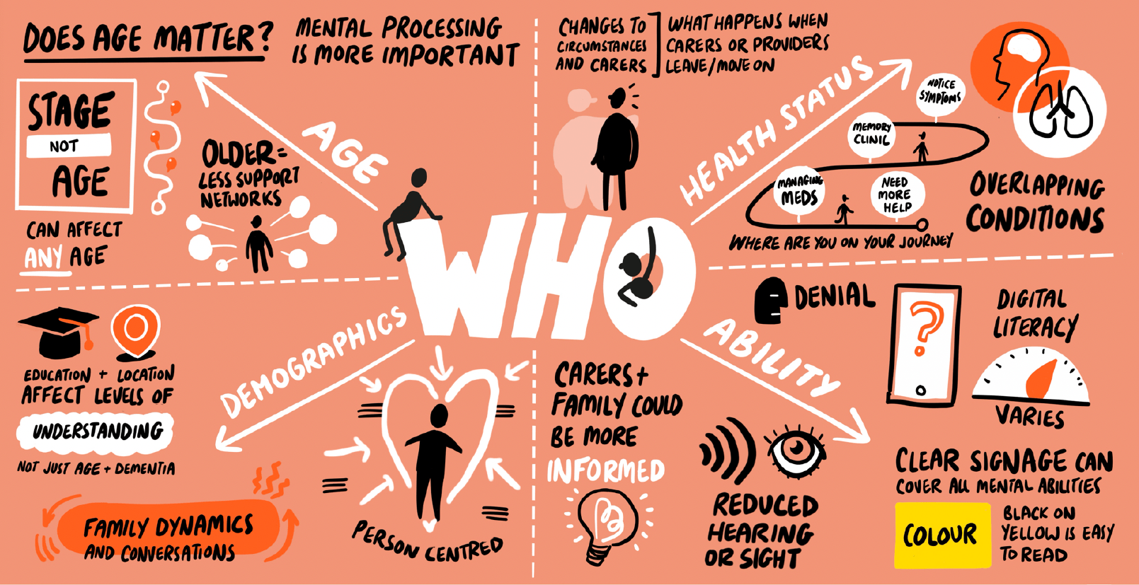 Live scribe image exploring the needs of people with dementia around medicine management
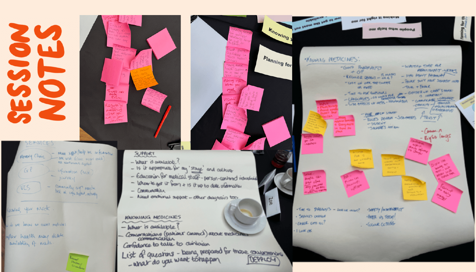 Session notes from co-design workshops with people living with dementia
The evidence base for visual methods is growing. Here are two other projects we found interesting:
-
Illustration-based interviews in urban planning research [2].
-
Participatory visual methods exploring young people’s identities [3].
3. Communicating your outputs
Most researchers are familiar with using visuals to communicate research findings. Back in the day, conference posters included pictures and diagrams glued onto backing card. How the visuals are produced has progressed! The reason for using them remains the same.
In our blog ‘Why use visual storytelling?’ we walk you through all the statistics about why visuals work. Much of it is to do with our fabulous visual brains. We are much better at processing visual info and remembering visual info [4]. Ask the marketing specialists. It turns out a picture is worth 60,000 words [5]. Are you still reading this blog?

Let's agree, using visuals to communicate your research findings is a smart move. However, there are still pros and cons to each creative technique [6]. At Nifty we can help you think through common pitfalls and select the right approach. Our production process is designed to relieve some common difficulties experienced. For example, it is tempting to include too much detail in your infographics. Don’t worry, we won’t let you!
So what now?
- If you need to include any of this evidence to support a funding bid or project application, download our handy research rationale doc (a nice boring Word document that won't scare reviewers ;)!).
- Get in touch if you are tempted to explore visual research methods and you’d like some help. We love a visual challenge!
References
[1] - The Mind’s Eye by Susan Hagen Read Online
[2] ‘Bonkers but good!’ – Using illustration-based interview methods to understand land management and conservation visions Read the academic paper
[3] Participatory visual methods: exploring young people’s identities, hopes and feelings. Read the academic paper
[4] - Brain Rules, by John Medina Read Online
[5] - Visual Marketing Explained: A Picture’s Worth 60,000 Words, by James Spillane Read online
[6] - Blog: Creative communication tools can bring research findings to a wider audience, NIHR Read online
View All Blogs


